

Are you ready to demonstrate the impact of your work? Then it’s time to get comfortable with data! Understanding and following internal comms measurement best practices will be critical for building influence within your business and maintaining a seat at the table.
But let’s face it, data and analytics can be intimidating for many of us. Not to mention, we’re not always sure what to do with our data once we have it. That’s why we’ve put this blog together. We’re here to help you navigate measurement and data visualization best practices with confidence.
Let’s start with the basics. How do we even go about measuring internal communications?
You’re probably most familiar with metrics like:
But all those metrics can be considered “vanity metrics” if we don’t do anything other than count them. If you just track content opens over time, all you’ll know is if you’re moving the needle on creating content that people want to read. But that’s not the true value of internal comms, is it?
No! You do so much for your organization. That’s why we also need ways to prove our greater impact. For instance, how have your internal communications campaigns improved retention, productivity, worker safety, and Net Promoter Scores?
You can use internal comms measurement tools like surveys, focus groups, and even other data from other departments to start putting that story together.
If you’re looking for a crash course on all things internal comms measurement, download our free ebook to learn everything you need to know 👇
[optin-monster slug=”ly10xbc2jhbvwxtwwkrm” followrules=”true”]
But once you have your data, you’re not done! You have to learn from it and share your newfound wisdom with leadership.
To do that, you need:
Data visualization is the art and science of presenting data in a visual way to make complex information easy to understand and interpret.
When done right, these graphics are powerful tools that help us tell stories with data, revealing insights and patterns that might be difficult to discern from raw numbers alone. Whether it’s a simple bar chart, a heat map, or an interactive dashboard, data visualization can help us make sense of information, uncover hidden trends, and communicate our findings with impact.
By presenting data visually, we can engage our audience, spark meaningful conversations, and drive better decision-making. So, if you want to turn your data into a compelling story, it’s time to start exploring the world of data visualization!
Before you choose the right graph for your data story, keep a few data visualization best practices in mind.
In the rest of this blog, we’ll share a few different types of data visualization and when to use each.
A line graph is a chart that displays information as a series of points connected by straight lines. Their primary use is to show changes in data over time, making them a simple and effective way to show trends or patterns.
So, let’s get technical. In a line graph:
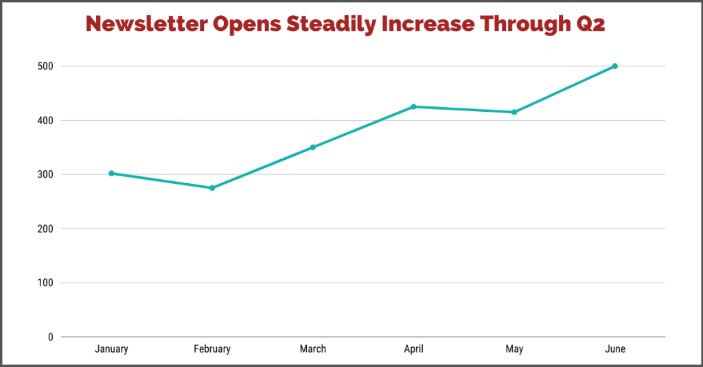
Let’s talk about an example. You might use line graphs to show app or newsletter opens over time. Or you can use this to show the average video view duration over time. This is a great visual to see if new or modified tactics are paying off.
You can also use stacked line graphs to show how two dependent variables change in relation to each other over time. So, you might want to show app downloads on the same chart as retention or the number of helpdesk questions the IT and HR teams process. This might help you see if there is a correlation between better communication and some larger business impact.
But don’t use a line graph for:
Use these charts to graph categorical data or data sorted into groups for comparison. In a bar chart, data is displayed using rectangular bars, where the height or length corresponds to the value of the data for that group or item.
Bar charts have a horizontal axis that represents the categories or groups being compared. And the vertical axis is the scale of measurement.
And there are many types of bar charts. The classic vertical bar chart is likely the most familiar to you, but a horizontal bar chart is useful when you have longer category names. You can also use stacked bar charts to illustrate the parts or components of a given category and compare the categories.
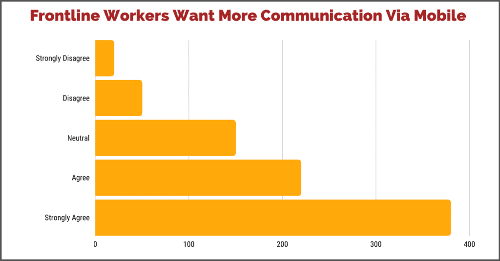
As an internal comms pro, here are a few examples of how you might use bar charts:
An area graph is a type of chart that displays data using colored or shaded areas. Like a line graph, it’s commonly used to show changes in data over time. But with an area graph, the area under the line is filled in with color or shading to emphasize the magnitude of change.
Note that area graphs let you show positive and negative data—some area charts go below the x-axis to show the fall in your data set. Unlike your regular line graph, these show part-to-whole relationships over time.
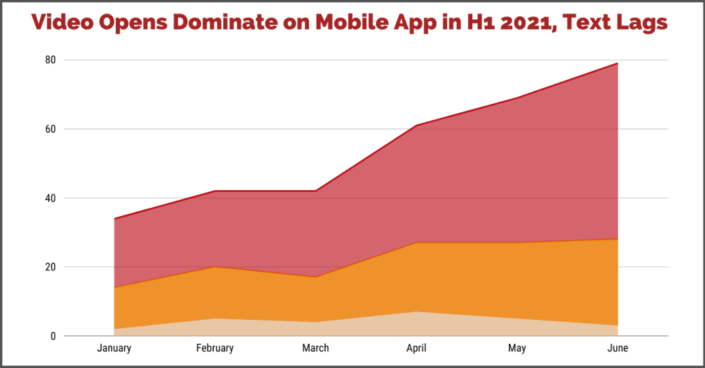
You might use area graphs to show a trend over time (like line graphs) but also what makes up that total. For instance, you might want to show content opens over time, but you also want to illustrate what types of content make up the total opens. This would let you show, for example, how your podcast, videos, and PDF/text-based content perform compared to each other.
A pie chart is a circular chart that displays data as slices of a pie where each slice represents a category or group. The size of the slice corresponds to the proportion or percentage of the data that belongs to that category.
This chart type is very often misused. Sometimes, people mistakenly use them to compare data sets. But if you’ve ever seen this done, have you noticed that it’s really difficult to compare two different pie charts side-by-side? That’s because relative size is hard to gauge in this way.
That’s why pie charts should ONLY be used to express a part-to-whole relationship. Period.
But also remember that sometimes pie charts are used and the slices aren’t different enough in size to show you anything meaningful. When the parts are all similar in size, it can be difficult to see the trend or point of the data visualization. So, these charts only make sense when one part is relatively small or big compared to everything else.
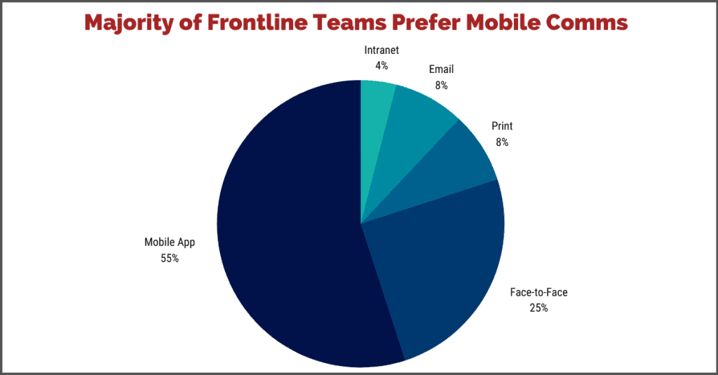
You might choose to use pie charts to represent employee survey answers, especially when there is a definitive top or bottom result.
Of course, there are many more chart varieties than we’ve shared in this blog. For a more in-depth explanation check out this chart guide from Storytelling with Data.
Once you have selected the right graph, you’re ready to start telling your data story:

Create a comms plan that makes you a strategic advisor.

Ready to take comms mobile? Here are 5 things you'll want in an app.

These 3 marketing tactics will help you be a better communicator.